The new Florabella logo: bee, geometry and gold
A bee is an almost inevitable choice for a honey brand. The real question, then, wasn't whether to put one in the Florabella logo, but how to make it ours.
We chose an essential mark, built on symmetry, geometry and a warm gold that recalls freshly harvested honey. We didn't just want an elegant symbol: we wanted an identity that could unite the two souls of the project — the nature of Wielkopolska and a distinctly Italian visual sensibility.
1. Why we redesigned Florabella
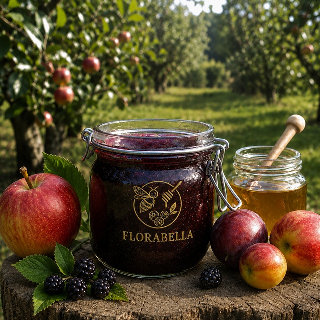
Florabella's first identity was an illustration: a detailed bee enclosed in a circle, accompanied by a honey dipper, a few blueberries and a sprig. It said a great deal — perhaps too much. Each element added a piece of information, but together they created a crowded mark, hard to reproduce at small sizes and difficult to recognise at a glance.
A logo that works has to stay legible on a jar lid and as an Instagram profile icon alike. Hence the decision: remove what describes, keep what identifies. We moved from a drawing that explained the product to a symbol that represents the brand.
2. The bee: the central mark
The bee remains the protagonist, but its nature changes. It's no longer a naturalistic illustration: it's a mark built from a few clean lines. The wings are two mirrored teardrop shapes, the abdomen is set with horizontal bands that echo the real livery without copying it, the antennae are two slender, symmetrical strokes.
The aim was immediate recognition. A bee you understand in an instant, even at a few millimetres, and one that keeps its character even in a single-colour version.
3. Geometry and symmetry
The hive is one of the most fascinating examples of collective organisation in nature: its hexagonal cells, built with remarkable regularity, have been a symbol of order and efficiency for centuries. We wanted that idea of precision to be reflected in the logo.
The mark is built on a vertical axis of symmetry: the two wings balance, the body is centred, the proportions follow regular ratios. It isn't geometry for its own sake, but a way to convey, visually, the care and method with which we tend our colonies.
4. Why we chose gold
Gold naturally recalls honey and light, but for Florabella it also stands for the value of the time given to each colony. It's a colour that communicates warmth and substance: not the cold, metallic gold of ostentatious luxury, but the warm, amber tone of honey just drawn from the comb.
On the labels it becomes a hot-foil stamp that catches the light and shifts with the angle; against a dark background it gains depth. It's a tactile detail as much as a visual one: we want the jar to be felt in the hands, not only seen.
5. Typography with an Italian heart
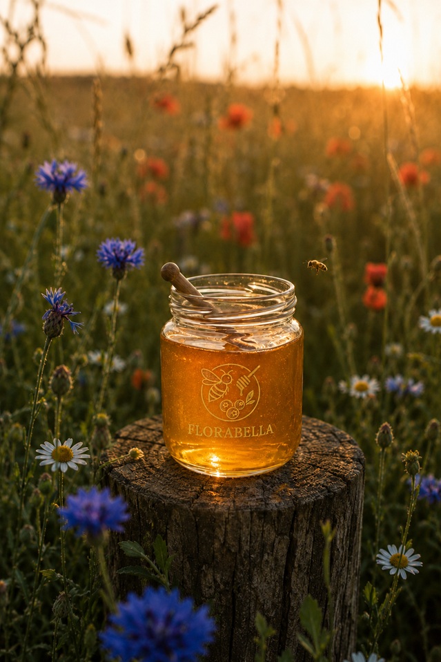
The "FLORABELLA" wordmark uses a serif typeface with classical lines, elegant serifs and generous proportions. The choice is deliberate: it recalls the Italian typographic tradition, made of restraint and refinement, and balances the symbol with an editorial, almost bookish tone.
The wide letter-spacing gives the name room to breathe and underlines its rhythm. The result is a balance between the mark — warm and organic — and the text — composed and orderly. Two registers that complete each other.
6. A mark designed to live anywhere
A contemporary identity has to adapt to very different contexts. The Florabella logo is designed to work in several configurations: the symbol alone as a social icon, symbol and wordmark together on the label, the single-colour version in gold on a dark ground or dark on ivory paper.
This flexibility is the proof of the minimalist choice: an essential mark adapts, a crowded illustration does not. From jar to digital, the identity stays coherent and recognisable.
What the logo promises
Behind the mark is the method. Florabella comes from a stationary apiary in Koziegłowy, Wielkopolska, with limited harvests and regular monitoring of the colonies. We leave the bees adequate stores, intervene only when necessary and document every intervention. These are choices that take time and may mean smaller harvests, but they keep our method coherent and transparent.
For those who want to look closer, the apiary's digital log gathers data over time on colony strength, queen presence, stores, harvests and Varroa infestation levels. It doesn't replace the beekeeper's observation, but it makes decisions more documentable.
The new logo is the signature of all this. An essential mark for a method that prefers to show, not promise.
Batch 001 comes soon. If this approach resonates, get in touch via WhatsApp or info@florabella.bio for first updates.
Want to see where this honey comes from?
The Hive Circle follows two hives through a full season, up close. Limited places for Founding Members 2026.
Discover the Hive Circle →